Enhance Mobile Apps with Progress Circles UI Kit
In the fast-paced world of mobile application development, the difference between a user who stays engaged and one who abandons an app often comes down to subtle design cues. Users crave feedback. When they upload a file, complete a lesson, or wait for a transaction to process, they need visual confirmation that the system is working. This is where the Progress Circles UI Elements Kit becomes an invaluable asset for designers and developers alike. Rather than building these interactive components from scratch, this collection offers a polished, ready-to-deploy solution that bridges the gap between functional code and aesthetic appeal.
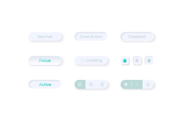
The kit is specifically engineered for modern web design and mobile interfaces that rely on a light theme. It moves beyond simple loading spinners to provide a comprehensive widget collection that includes status indicators, dashboard templates, and isolated vector icons. For professionals ranging from freelance developers to marketing teams launching new products, having access to high-quality assets like these can significantly streamline the production workflow while elevating the final product's perceived value.
Streamlining the Design-to-Development Handoff
One of the most persistent challenges in digital product creation is the friction between design concepts and technical implementation. Designers often create beautiful mockups that are difficult or time-consuming for developers to recreate accurately in code. The Progress Circles UI Elements Kit mitigates this issue by providing source files in a wide array of formats. Because the ZIP file contains EPS, JPG, PNG, SVG, and AI files, the assets are versatile enough to fit into any stage of the pipeline.
For instance, a UI designer working in Adobe Illustrator can manipulate the AI files to tweak colors or stroke widths to match a specific brand guideline perfectly. Meanwhile, a front-end developer can take the SVG files and integrate them directly into the application code. SVGs are particularly crucial for progress indicators because they remain crisp at any resolution, ensuring that the interface looks sharp on both older smartphones and the latest high-density displays. This flexibility eliminates the need to export multiple raster versions for different screen densities, saving hours of repetitive work.
Enhancing User Experience Through Visual Clarity
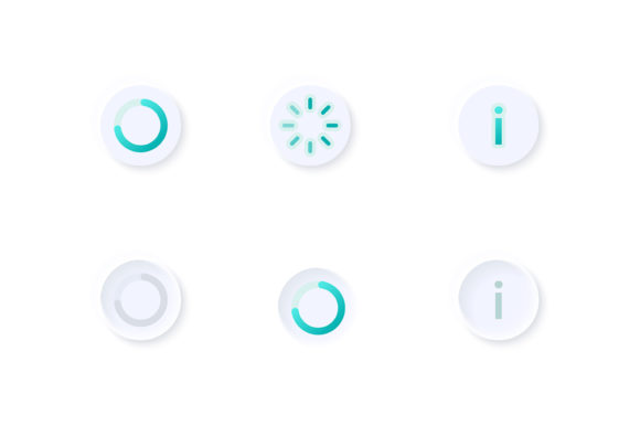
The primary function of any progress indicator is communication. A vague loading animation can cause anxiety, leading users to believe the app has frozen. The components within this kit, including the waiting status isolated vector icon and various bar configurations, are designed to provide clear, unambiguous feedback. By using circular progress elements, designers can convey completion percentages in a way that feels organic and less intrusive than linear bars, which often dominate valuable screen real estate on mobile devices.
Consider a fitness application tracking a user's daily water intake. A circular progress widget allows the user to glance at their dashboard and instantly understand how close they are to their goal without reading numbers. The light theme interface ensures that these elements blend seamlessly with clean, airy designs that are popular in health and wellness apps. This clarity supports better decision-making for the user; seeing a nearly full circle might encourage them to drink one last glass of water to complete their streak, thereby increasing engagement with the app.
Practical Applications Across Industries
The utility of the Progress Circles UI Elements Kit extends far beyond generic loading screens. Its modular nature makes it suitable for a diverse range of industries and use cases. Educators developing e-learning platforms can utilize the dashboard templates to show course completion rates. When a student finishes a module, a smooth animated circle filling up provides a sense of accomplishment that text alone cannot achieve. This gamification element is vital for maintaining motivation in self-paced learning environments.
Similarly, small business owners managing inventory or sales dashboards can benefit from the bar and widget collections included in the package. Visualizing data through well-designed progress circles helps stakeholders quickly identify bottlenecks or successes. A marketer analyzing campaign performance might use these elements to present data to clients, turning raw statistics into an easily digestible visual story. The professional quality of the vectors ensures that these presentations look credible and polished, reinforcing the authority of the data being presented.
Optimizing Workflow for Freelancers and Agencies
For freelancers and agencies operating under tight deadlines, time is the most critical resource. Building a custom progress animation library from scratch involves not only designing the shapes but also testing them across different browsers and devices to ensure compatibility. By leveraging a pre-made kit, creators can bypass the initial design phase and focus on customization and integration. This efficiency allows agencies to take on more projects or dedicate extra time to refining the micro-interactions that make an app feel premium.
Furthermore, the inclusion of multiple file formats means that these assets are future-proof. If a client decides to pivot from a mobile app to a responsive web platform, the SVG and EPS files scale effortlessly. This adaptability protects the investment made in the design phase. Instead of recreating assets for a new medium, the team simply adjusts the implementation, ensuring consistency across all touchpoints of the brand.
Technical Considerations and Integration
While the benefits of using a dedicated UI kit are clear, it is important to consider how these elements fit into the broader technical architecture of an application. The Progress Circles UI Elements Kit is designed with a light theme interface, which is ideal for applications aiming for a clean, modern aesthetic. However, designers should be mindful of contrast ratios when integrating these white-background assets into darker sections of an app, or they may need to recolor the vectors using the provided AI or EPS files to ensure accessibility compliance.
The "waiting status" icons included are particularly useful for asynchronous operations. In scenarios where network latency is unpredictable, such as uploading large media files or processing payments, having a distinct, calming waiting indicator prevents user frustration. The isolated nature of these vector icons means they can be placed anywhere in the layout without carrying unnecessary background baggage, allowing for seamless integration into complex dashboard templates.
Making the Right Choice for Your Project
Not every project requires a full suite of UI elements, but for those building data-heavy applications or platforms reliant on user progression, this kit offers a substantial advantage. It is particularly well-suited for entrepreneurs launching MVPs (Minimum Viable Products) who need to look established and trustworthy from day one. High-quality UI signals to investors and early adopters that attention has been paid to detail, fostering trust in the product's reliability.
However, users should evaluate their specific needs before diving in. If an application relies heavily on dark mode, the light theme assets will require modification. Fortunately, the vector formats included make this straightforward for anyone with basic design skills. Additionally, while the kit provides excellent static and animated-ready structures, developers must still handle the logic that drives the progress values. The kit provides the vessel, but the code provides the motion.
Ultimately, the value of the Progress Circles UI Elements Kit lies in its ability to standardize quality while accelerating production. It removes the guesswork from designing effective feedback loops, allowing creators to focus on the core functionality of their applications. Whether you are a blogger launching a membership site, a developer building the next big productivity tool, or a corporate team updating an internal dashboard, having a reliable set of progress indicators can transform a functional interface into an delightful user experience. By reducing development time and enhancing visual communication, this collection serves as a practical foundation for building better digital products.