Mastering Modern Interfaces with the Panels UI Elements Kit
In the rapidly evolving landscape of digital product design, the difference between a functional application and an exceptional one often lies in the details. Users today possess a refined intuition for interface quality; they expect seamless interactions, intuitive navigation, and visual clarity without needing to think about it. For professionals ranging from freelance developers to enterprise marketing teams, the pressure to deliver high-fidelity prototypes and production-ready assets quickly has never been higher. This is where comprehensive design resources like the Panels UI Elements Kit become indispensable tools in the modern creator's workflow.
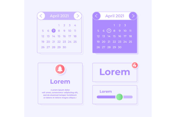
The shift toward mobile-first strategies has fundamentally changed how we approach web and app design. It is no longer sufficient to simply shrink a desktop website to fit a phone screen. Instead, interfaces must be built from the ground up with touch targets, thumb zones, and vertical scrolling behaviors in mind. The Panels UI elements kit addresses this specific need by offering a curated collection of components designed explicitly for mobile applications. By focusing on a light theme interface, the kit taps into a prevailing aesthetic preference that emphasizes cleanliness, readability, and a sense of openness—qualities that are crucial for reducing cognitive load on smaller screens.
The Evolution of User Expectations and Design Efficiency
Over the last decade, user expectations have undergone a dramatic transformation. In the early days of smartphone apps, novelty was enough to retain users. Today, retention is driven by usability and speed. If a user encounters a confusing menu or a sluggish search function, they are likely to abandon the app within seconds. This reality has forced designers and developers to prioritize efficiency not just in code, but in the design process itself.
Historically, creating a consistent UI library required hundreds of hours of manual vector work. Designers would draw every button, input field, and icon from scratch, often leading to inconsistencies in stroke weight, color usage, and spacing. The market has responded to this bottleneck with modular design systems. The Panels UI Elements Kit represents this evolution, providing a pre-built foundation that allows creators to skip the repetitive groundwork and focus on unique brand expression and user experience logic.
Furthermore, the trend toward "light theme" interfaces is not merely a stylistic choice; it is a functional one. While dark modes have their place, light themes remain the standard for productivity apps, e-commerce platforms, and content-heavy services. They offer superior legibility in varied lighting conditions, particularly outdoors, and convey a sense of professionalism and trustworthiness. A well-executed light theme relies heavily on subtle shadows, crisp borders, and ample whitespace—all elements that are meticulously crafted within this widget collection.
Deconstructing the Core Components
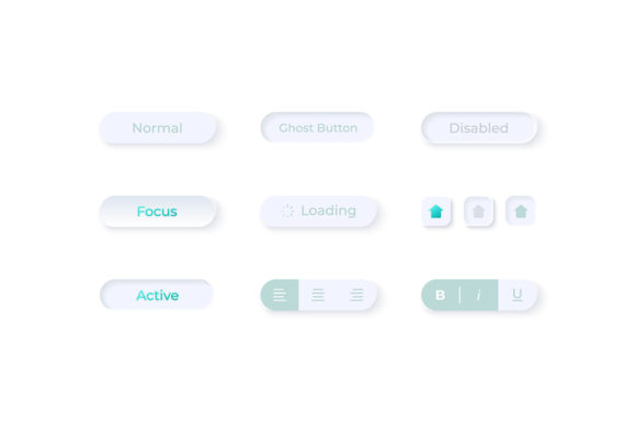
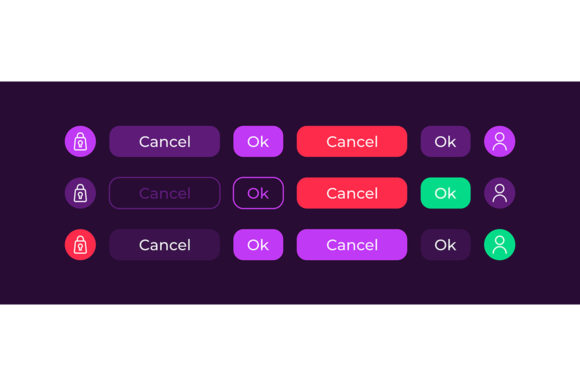
To understand the practical value of this kit, one must look at the specific elements it provides. A robust UI kit is more than a bag of random graphics; it is a cohesive system where every part works in harmony. The Panels UI elements kit includes several critical components that form the backbone of almost any mobile application.
Search Fields and Input Mechanisms
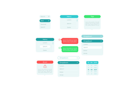
Search functionality is often the primary entry point for users looking for specific content. A poorly designed search bar can lead to zero-result pages and frustrated users. The kit includes optimized search fields that account for placeholder text, active states, and clear action buttons. These elements are designed to be prominent yet unobtrusive, guiding the user naturally toward interaction. For e-commerce apps or directories, having a polished search interface ready to deploy can significantly accelerate the development timeline.
Pick Options and Selection Controls
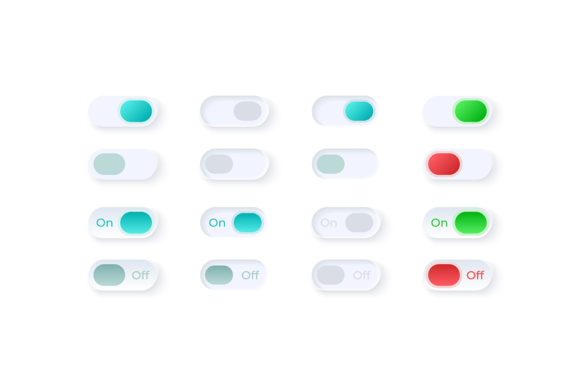
Data entry on mobile devices can be tedious. The "pick option" components included in the set streamline this process. Whether it is a dropdown selector, a radio button group, or a custom picker wheel, these elements are engineered for touch accuracy. They ensure that users can make selections without accidentally hitting adjacent targets, a common pain point in cramped mobile layouts. By standardizing these controls, designers ensure a predictable and comfortable experience across different sections of the app.
Settings and Isolated Vector Icons
Navigation and configuration are vital for user retention. The inclusion of isolated vector icons for settings, profiles, and notifications allows for immediate visual recognition. Because these are vector-based, they scale perfectly regardless of the device's pixel density, ensuring sharpness on both standard retina displays and high-resolution OLED screens. The isolation of these icons means they can be easily recolored or animated to match specific brand guidelines without losing quality.
Bars and Dashboard Templates
Perhaps the most complex part of any application is the dashboard. This is where data visualization meets user interaction. The kit provides bar charts and dashboard templates that transform raw data into digestible visual stories. For fintech apps, health trackers, or analytics tools, having a pre-designed dashboard template saves immense amounts of time. These templates are structured to handle dynamic data while maintaining visual balance, preventing the interface from looking cluttered even when displaying multiple metrics.
Technical Flexibility and File Formats
A major consideration for any professional adopting a new design resource is compatibility with their existing toolchain. The Panels UI Elements Kit acknowledges the diverse ecosystem of design software by distributing its assets in a ZIP file containing EPS, JPG, PNG, SVG, and AI formats. This multi-format approach ensures that the kit is accessible to everyone, regardless of their preferred workflow.
- AI (Adobe Illustrator): Ideal for designers who need to edit the source vectors, adjust anchor points, or modify the core structure of the components.
- EPS: Provides broad compatibility with various vector editing programs, ensuring that legacy systems or alternative software users are not left out.
- SVG: The gold standard for web and mobile development. SVGs can be directly implemented into code, allowing for scalability and interactivity without increasing file size.
- PNG: Perfect for rapid prototyping, presentations, or situations where a raster image with transparency is required for mockups.
- JPG: Useful for quick previews or documentation where file size is a constraint and transparency is not needed.
This versatility means that a team can collaborate effectively even if members use different tools. A developer can take the SVG files straight into the codebase, while a marketer can use the PNGs for social media teasers, and a UX designer can tweak the AI files for custom variations. This fluidity reduces friction in the handoff process between design and development, a notorious bottleneck in many projects.
Practical Implications for Professionals and Businesses
For entrepreneurs and business owners, time is a currency as valuable as capital. Utilizing a comprehensive kit like Panels UI elements kit allows startups to launch Minimum Viable Products (MVPs) faster. Instead of spending weeks designing basic UI components, teams can focus on validating their core business logic and unique features. This acceleration can be the difference between capturing a market opportunity and missing the window entirely.
Freelancers and agencies also benefit significantly. Consistency is key to building a strong portfolio and maintaining client trust. By using a unified set of elements, freelancers can ensure that every project they deliver meets a high standard of visual coherence. Moreover, the ability to customize these elements means that no two projects need to look identical. The kit serves as a skeleton, upon which the unique flesh of the brand is added.
Educators and students in design fields can use these resources as learning tools. Analyzing how professional components are constructed—how a shadow is applied to a card, how a gradient is used in a button, or how spacing is managed in a list—provides invaluable insights into industry standards. It bridges the gap between theoretical knowledge and practical application.
Adapting to Future Trends
While the current focus is on light theme interfaces and mobile optimization, the principles embedded in the Panels UI Elements Kit are future-proof. The move toward minimalism and clarity is not a fleeting trend but a response to information overload. As technology integrates further into daily life through wearables and IoT devices, the need for clean, glanceable interfaces will only grow.
Additionally, the emphasis on vector graphics prepares creators for the next generation of displays. As screen resolutions continue to increase and variable refresh rates become standard, raster-based designs risk looking pixelated or outdated. Vector-based workflows ensure longevity and adaptability.
Ultimately, the value of such a kit lies in its ability to empower creators. It removes the technical barriers to entry for high-quality design, allowing individuals to focus on creativity, strategy, and problem-solving. Whether you are building a fitness tracker, a financial planner, or a social networking platform, having a reliable foundation of UI elements allows you to build with confidence.
In conclusion, the Panels UI elements kit is more than just a collection of graphics; it is a strategic asset. It aligns with modern user expectations, supports efficient workflows, and provides the technical flexibility required in today's diverse development environments. By leveraging these resources, professionals can navigate the complexities of mobile design with greater ease, delivering products that are not only functional but also delightful to use.