Elevating User Experience with the Loading UI Elements Kit
We have all been there. You tap a button on your phone, and for a split second, nothing happens. That moment of uncertainty is where good design separates itself from the forgettable. If the screen freezes, users assume the app has crashed. If a spinner appears instantly, they know the system is working. This is the exact problem the Loading UI Elements Kit solves. It is not just a folder of icons; it is a toolkit for managing user patience and perception in real-time.
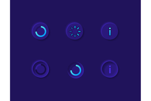
In the world of mobile application development, specifically within dark theme interfaces, the stakes are even higher. Dark mode isn't just an aesthetic choice anymore; it is a standard expectation for many users who prefer reduced eye strain or battery conservation. However, designing loading states for dark backgrounds requires a different touch than light modes. The contrast needs to be perfect, and the animation logic must feel smooth against deep blacks and grays. This collection addresses that specific niche, offering uploading progress indicators, info circles, and dashboard templates that are pre-optimized for these environments.
Bridging the Gap Between Action and Result
The primary value of this kit lies in its ability to bridge the gap between a user's action and the system's response. Consider a fitness app where a user uploads a heavy workout video. Without a visual cue, the user might mash the "upload" button repeatedly, causing errors. With the uploading progress bars included in this set, the interface communicates clearly: "We got it, give us a second."
This is particularly vital for industries dealing with large data sets or media files. For example, in cloud storage applications or photo editing suites, the upload process can take anywhere from a few seconds to several minutes. A static icon won't cut it here. You need dynamic bars that fill up, perhaps changing color as they near completion, to give a sense of momentum. The vector icons in this pack, available in formats like SVG and AI, allow developers to animate these paths easily, creating a fluid experience that feels native to the operating system rather than tacked on.
Tailoring Experiences for Different Audiences
Different users interact with loading screens in different ways, and a one-size-fits-all approach rarely works. The versatility of this widget collection allows designers to tailor the experience based on the specific audience.
- Gamers and Entertainment Apps: For a gaming dashboard, the loading state is part of the immersion. The isolated vector icons can be customized to match the game's art style. A simple spinning circle might be boring, but a themed progress bar that looks like a health meter keeps the player engaged while the level loads.
- Finance and Banking Sector: Trust is the currency here. When a user is transferring funds, they need clarity, not flair. The clean, geometric info circles and precise percentage bars in this kit convey stability. The dark theme interface adds a layer of sophistication often associated with premium financial tools, reassuring users that their transaction is being processed securely.
- Creative Professionals: Designers using portfolio apps or rendering software appreciate transparency. They want to know exactly how much time is left. The dashboard templates included in the ZIP file provide a structured way to display complex loading information, such as "Rendering Layer 3 of 10," without cluttering the screen.
The Technical Advantage of Vector Formats
One of the most practical aspects of this resource is the file format diversity. The package includes EPS, JPG, PNG, SVG, and AI files. While a JPEG might work for a quick mockup, it falls apart when you need scalability. Mobile devices come in all shapes and sizes, from compact phones to massive tablets. Vector formats like SVG and AI ensure that your loading spinners remain crisp whether they are displayed on a low-resolution budget device or a high-DPI flagship screen.
Furthermore, vectors are code-friendly. Developers can often inline SVG code directly into the application, allowing for CSS or JavaScript manipulation. This means you can change the color of a loading bar dynamically based on the user's progress or system status without needing to load new image assets. This efficiency is crucial for mobile apps where performance and load times are critical metrics.
Designing for the Dark Theme Ecosystem
Creating assets for a dark theme interface is trickier than it looks. You cannot simply invert colors from a light theme. Shadows behave differently, and glow effects become essential for visibility. The Loading UI Elements Kit acknowledges this by providing elements specifically curated for dark backgrounds.
Notice how the info circles in this set likely utilize lighter strokes or subtle glows to stand out against the dark backdrop. This prevents the "muddy" look that occurs when gray icons disappear into a dark gray background. For dashboard templates, this distinction is key. A dashboard is information-dense; if the loading states blend in too much, the user loses context. These elements are designed to pop just enough to grab attention without being distracting or harsh on the eyes during night-time usage.
Practical Considerations Before Implementation
Before diving into integrating these elements, there are a few things to consider to ensure they serve their purpose effectively. First, think about the duration of the load. If a process takes less than a second, a complex animation might be overkill and actually make the wait feel longer. In such cases, a simple, subtle pulse from the info circle collection might be more appropriate than a full progress bar.
Second, consider the emotional tone of your brand. A playful consumer app might benefit from a bouncy, colorful loader, whereas a medical or enterprise application requires something steady and neutral. The isolated nature of these vector icons makes them easy to recolor. You can take the base SVG and apply your brand's hex codes instantly, ensuring consistency across the entire application.
It is also worth noting the limitation of static images. While the JPG and PNG files in the kit are great for presentations or static prototypes, they lack the interactivity required for final production. Relying solely on raster images for loading states can lead to pixelation on newer devices. Always prioritize the vector files (AI, EPS, SVG) for the actual build phase to future-proof your design.
Enhancing the Dashboard Experience
Dashboards are the command centers of modern applications. Whether it is an analytics tool for marketers or a server monitor for IT professionals, dashboards constantly fetch new data. The dashboard template components in this kit are invaluable here. They provide a skeleton structure that shows users where data will appear while it is being retrieved.
This technique, often called "skeleton screening," reduces perceived wait time. Instead of staring at a blank white (or black) box, the user sees the outline of the chart or graph filling up. It creates an anticipation of content rather than an absence of it. By using the progress bars and info circles together, you can create a hierarchical loading system where critical data loads first, indicated by a completed circle, while secondary charts continue to buffer with a moving bar.
Ultimately, the goal of using a resource like the Loading UI Elements Kit is to make the technology feel invisible. When the loading states are well-designed, users don't notice them; they just feel that the app is fast and responsive. When they are poorly designed, every second feels like an hour. By leveraging these high-quality, versatile, and dark-mode-ready assets, you are investing in the smoothness of the user journey, ensuring that from the first tap to the final upload, the experience remains seamless and professional.