Option Switches UI Elements Kit: A Design Guide
Imagine you are building a mobile application. You have spent hours perfecting the color palette, selecting the right typography, and mapping out the user journey. Then, you reach the settings screen. It is time to add toggles, sliders, and checkboxes. This is often where momentum stalls. Instead of coding from scratch or hunting for inconsistent icons across different websites, a comprehensive resource like the Option Switches UI Elements Kit can bridge the gap between concept and completion. This collection is more than just a folder of images; it is a structured approach to interface consistency, offering a dark theme interface that feels modern and professional right out of the box.
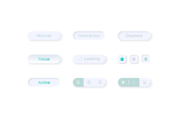
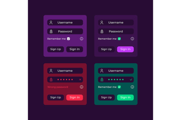
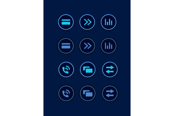
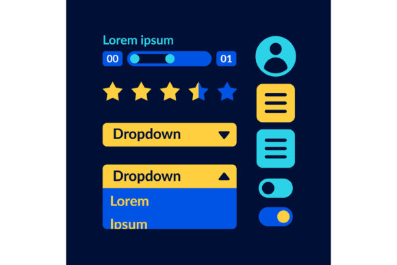
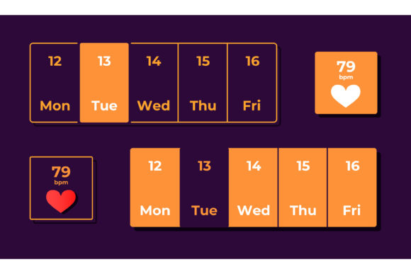
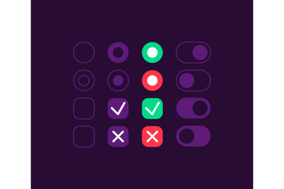
At its core, this kit provides the essential building blocks for user interaction. It includes isolated vector icons for settings, press buttons, bars, and dashboard templates designed specifically for mobile environments. The inclusion of multiple file formats—EPS, JPG, PNG, SVG, and AI—ensures that whether you are a developer needing scalable vectors or a marketer needing a quick preview image, the assets work for your specific workflow. But the value of such a kit changes drastically depending on who is holding the mouse.
Why Beginners Value Speed and Simplicity
For someone just starting their journey in web design or app development, the sheer number of decisions can be paralyzing. A beginner might not yet understand the nuances of vector scaling or why an SVG is superior to a PNG for interactive elements. For this group, the primary priority is ease of use and speed. They need components that look good immediately without requiring deep technical knowledge to implement.
A student or hobbyist creating their first portfolio project can use these pre-made switches to make their app look polished. Instead of struggling with CSS borders and shadow effects to create a toggle switch, they can import the SVG directly or use the PNGs for a prototype. The dark theme interface included in the kit is particularly helpful here, as designing a cohesive dark mode from scratch requires a good understanding of contrast ratios and accessibility standards. By using a pre-designed system, beginners avoid common pitfalls like low-contrast text or confusing interactive states, allowing them to focus on learning the logic of their application rather than getting stuck on pixel-perfect UI details.
The Professional's Need for Flexibility and Quality
Experienced designers and frontend developers view resources differently. They are less concerned with "making it look nice" and more focused on flexibility, quality, and integration. A professional knows that a static image is rarely enough; they need the ability to tweak colors, adjust stroke widths, or animate specific parts of a button. This is where the inclusion of AI (Adobe Illustrator) and EPS files becomes critical.
When a senior designer evaluates the Option Switches UI Elements Kit, they are looking at the underlying structure of the vectors. Are the layers named logically? Can the icon be easily recolored to match a client's brand guidelines? For a freelancer working under tight deadlines, the ability to open an AI file, change a hex code, and export a new asset in seconds is invaluable. Furthermore, professionals care deeply about reliability. They need to know that the dashboard template provided will scale correctly on different screen densities, from older smartphones to the latest high-resolution tablets. The variety of formats ensures that the workflow remains uninterrupted, regardless of the software stack being used.
Entrepreneurs and Business Owners: Cost and Presentation
Small business owners and entrepreneurs often wear many hats. They might be launching a startup MVP (Minimum Viable Product) with a limited budget. For them, the decision to use a UI kit often comes down to commercial value and presentation. Hiring a dedicated UI designer for a simple settings page might not be financially viable in the early stages. Instead, purchasing or utilizing a comprehensive kit allows them to present a high-quality product to investors or early users without the overhead cost.
An entrepreneur might use the dashboard templates to create pitch deck visuals that demonstrate how the final product will function. The dark theme interface adds a layer of sophistication that can make a prototype feel like a finished product. Their priority is not necessarily the editable vector paths, but rather the visual impact and the speed at which they can move from an idea to a tangible demonstration. If the kit allows them to skip weeks of design work and launch faster, it has succeeded in its purpose.
Educators and Content Creators
Educators teaching UX/UI courses or bloggers writing about app design trends have a unique perspective. They need materials that are clear, isolated, and easy to explain. When teaching students about the importance of toggle states (on vs. off), having a set of clean, isolated vector icons is incredibly useful for creating slides and tutorials. The JPG and PNG files allow for quick insertion into presentations, while the SVGs can be used in live coding demonstrations.
Similarly, content creators making videos about "Top Dark Mode Apps" or "Mobile Design Trends" can use these assets to create b-roll or graphical overlays. For this audience, the learning value and clarity of the assets are paramount. They need elements that clearly communicate function without visual clutter. The fact that the kit includes specific elements like "press buttons" and "bars" allows educators to break down complex interfaces into understandable components for their audience.
Making the Right Choice for Your Project
Ultimately, deciding whether the Option Switches UI Elements Kit fits your needs depends on what you are trying to achieve. If you are building a high-performance game where every millisecond of rendering time counts, you might need to code your own lightweight solutions. However, for most business apps, dashboards, and consumer-facing tools, the balance of quality and efficiency offered by a pre-made kit is hard to beat.
Consider your current constraints:
- Time: Do you have days to design custom icons, or do you need them today?
- Skill Level: Are you comfortable manipulating bezier curves in Illustrator, or do you prefer drag-and-drop simplicity?
- Consistency: Does your project require a unified dark theme that works across all screens?
The beauty of having a ZIP file containing EPS, JPG, PNG, SVG, and AI is that it covers almost every scenario. A marketer can grab a PNG for a social media post, while the developer on the same team grabs the SVG for the actual codebase. This versatility ensures that the asset remains useful long after the initial download.
In the fast-paced world of digital product creation, tools that reduce friction are essential. Whether you are a solo founder validating an idea, a student learning the ropes, or a seasoned agency delivering for a Fortune 500 client, having a reliable set of UI elements allows you to focus on what truly matters: solving user problems. The Option Switches UI Elements Kit serves as a foundation, providing the structural integrity needed to build interfaces that are not only functional but also visually engaging and intuitive.